

A blank living room wall is a missed opportunity. Done well, a gallery wall turns an empty stretch of paint into the most interesting thing in the room — a layered, personal display that pulls the whole space together. Below are 15 gallery wall ideas living room stylists reach for again and again, covering layouts, frame mixes, spacing rules, and budget tricks that actually work in real homes. Whether you own a stack of thrifted frames or you’re starting from zero, there’s a version here for your wall, your style, and your budget. Let’s plan it properly so you only put holes in the wall once.
1. Start With a Plan: Measure Your Wall First
Every good gallery wall starts with a tape measure, not a hammer. Measure the width and height of your wall, then mark the outer boundary of your planned display with painter’s tape right on the wall. Most living room gallery walls look best when the whole arrangement spans roughly two-thirds the width of the furniture below it — for a standard 84-inch sofa, that means a display about 55 to 60 inches wide. Also decide your vertical zone before you hang anything. The center of the arrangement should sit at eye level, around 57 to 60 inches from the floor. Above a sofa, leave 6 to 10 inches between the top of the sofa back and the bottom frame so the grouping reads as one connected display rather than art floating near the ceiling. Of all the gallery wall ideas living room owners attempt, skipping this planning step is the reason most of them look slightly off.
2. Choose a Layout That Fits Your Living Room
The layout is the skeleton of your gallery wall. Pick the structure first, then choose art to fill it — not the other way around. These layout-first gallery wall ideas living room designers rely on work in nearly every space, from sprawling open plans to compact flats.
The Classic Grid
Same-size frames, evenly spaced in straight rows and columns. The grid is the most forgiving of all gallery wall ideas living room beginners can try, because the structure does the styling for you. It suits calm, modern, and traditional rooms, and it looks especially sharp with black-and-white photography or a series of botanical prints.
Salon Style
An organic cluster of mixed sizes and frames, built outward from one central anchor piece. Salon style looks effortless but needs the most planning — lay it out on the floor first and photograph it before anything touches the wall. It shines in eclectic, bohemian, and collected-over-time living rooms.
The Picture Ledge
Two or three floating shelves with art leaned in overlapping layers. This is the renter-friendly champion: two ledges, zero wall damage beyond the shelf brackets, and you can restyle in minutes. Lean larger pieces at the back and smaller ones in front for depth.
The Corner Wrap
Let the display turn the corner onto the adjoining wall. Wrapping a gallery wall around a corner makes a small living room feel larger and more intentional, and it solves the awkward “what goes on that sliver of wall” problem beautifully.
3. Budget-Friendly Gallery Wall Ideas Living Room Renters Will Love
You don’t need a big budget to build a gallery wall with real presence. Thrift stores and flea markets are full of solid wood frames for a few dollars each — buy for the frame, not the art inside, and unify mismatches with a single coat of spray paint in matte black, white, or brass. These budget-friendly gallery wall ideas living room renters love prove that a tight budget is a style advantage, not a limitation: constraints force the collected, personal look that expensive matching sets can never fake.
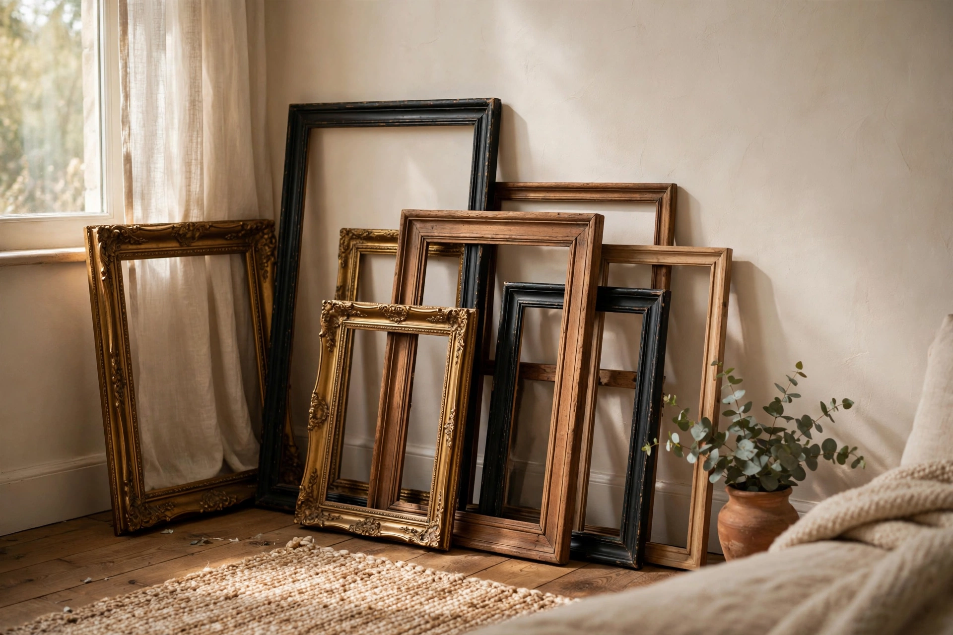
For the art itself, printable downloads from independent artists cost a fraction of framed prints — print them at a local copy shop in large format for under $10 a piece. Kids’ artwork, pages from old books, fabric swatches, and even beautiful wrapping paper all frame up surprisingly well. And don’t overlook the empty frame trick: a cluster of empty vintage frames in varying sizes makes a sculptural statement for almost nothing.
4. Mix Frames Like a Designer
The difference between a gallery wall that looks curated and one that looks chaotic usually comes down to frame discipline. Pick two, at most three, frame finishes and repeat them throughout — black plus natural oak plus one brass accent is a combination that works in almost any living room. Repeating finishes creates rhythm, which is what lets you get away with mixing art styles freely. This finish discipline is the quiet difference between gallery wall ideas living room guests admire and ones that just look busy.
Size matters as much as finish. Every strong arrangement has an anchor: one piece noticeably larger than the rest that the eye lands on first. Build outward from it, alternating orientations so the overall shape stays roughly balanced. If everything is the same small size, the wall reads as clutter; if one piece dominates without support, it reads as a mistake. Aim for a clear largest, a clear smallest, and a comfortable middle.
5. Spacing Rules That Make It Look Professional
Here’s the rule designers actually follow: keep 2 to 3 inches of space between frames, consistently. Wider gaps make pieces feel disconnected; tighter gaps make them feel cramped. Consistency matters more than the exact number — pick 2.5 inches and commit to it across the whole wall.
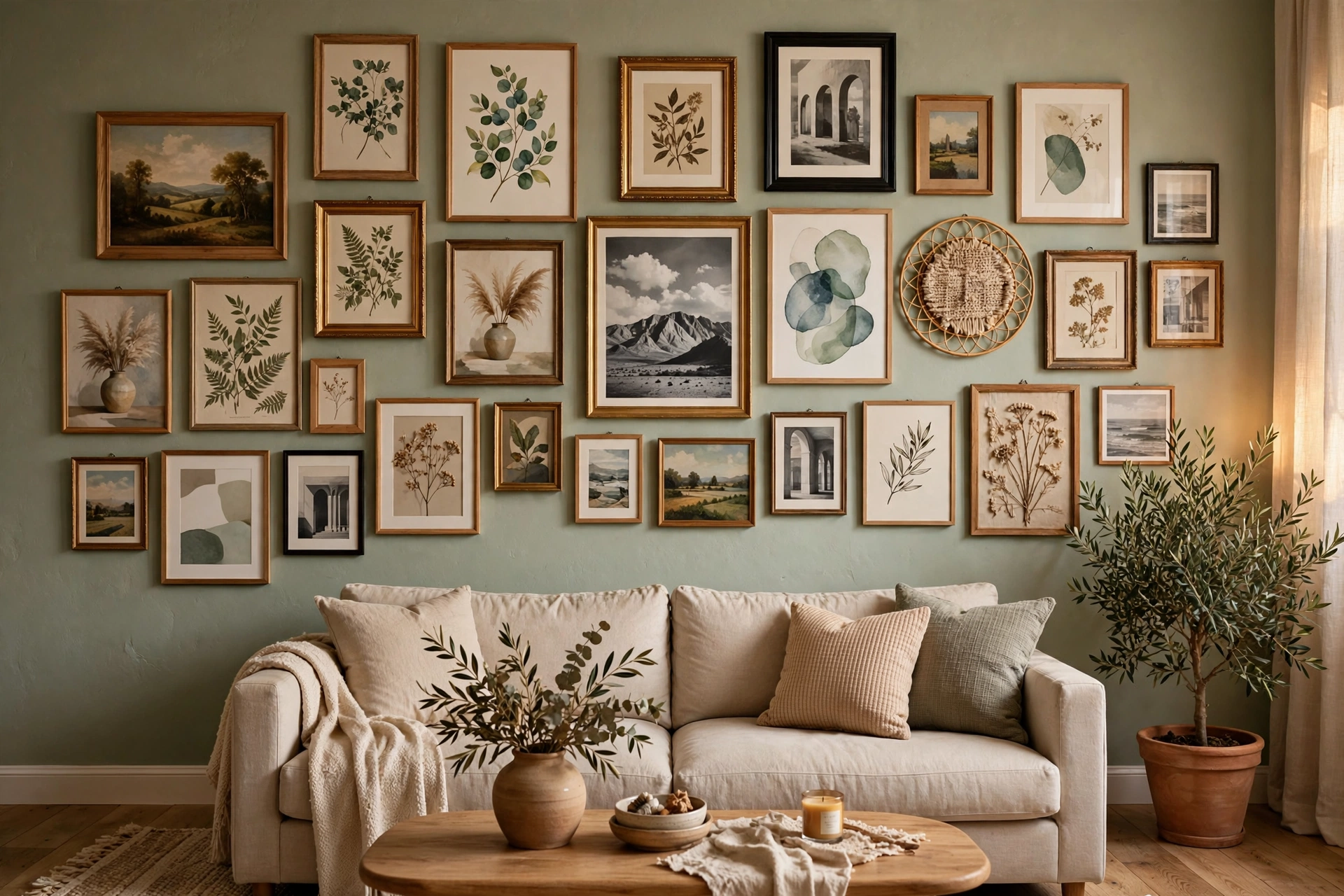
Also treat the entire grouping as one single piece of art when positioning it. Center the whole arrangement over the sofa or console, not each frame individually, and keep that 57-to-60-inch eye-level center. Consistent spacing is the quiet secret behind gallery wall ideas living room photographers love — step back across the room every few frames as you hang, because gallery walls are judged from the sofa, not from six inches away.
6. What to Hang: Art Mixes That Actually Work
A memorable gallery wall is rarely all one thing. The most interesting displays mix mediums while holding one element constant — same frame color with wildly different art, or wildly different frames with a tight color palette. These mix-and-match gallery wall ideas living room collectors love prove that cohesion beats matching every single time. For even more real-room examples beyond these gallery wall ideas, living room inspiration is easy to find: browse The Spruce’s 52 gallery wall ideas to see how designers combine these elements in finished spaces.
Prints and Photographs
The backbone of most displays. Mix black-and-white family photos with colorful art prints — the monochrome photos act as visual rest stops that keep colorful pieces from overwhelming the wall. Keep photo sizes varied but stick to one finish family for cohesion.
Mirrors
One or two small mirrors in a gallery wall bounce light around and make the living room feel bigger — especially valuable on walls opposite windows. Round mirrors break up all the rectangles beautifully. Just avoid placing a mirror where it reflects clutter or the TV screen.
Textiles and Objects
Woven wall hangings, small embroidery hoops, decorative plates, or a vintage wall clock add texture that flat prints can’t. One three-dimensional object per grouping is plenty — more than that and the wall starts reading as a shelf that lost its way.
7. Style Your Gallery Wall Around the Sofa
The wall above the sofa is the most common gallery wall location, and it has its own rules. The arrangement should span about two-thirds of the sofa’s width — wider looks like it’s swallowing the furniture, narrower looks lost. Keep the bottom edge 6 to 10 inches above the sofa back so someone leaning back doesn’t knock a frame. It’s one of those small gallery wall ideas living room designers never skip.
Prefer one big statement piece to many small ones? That’s a valid instinct — a single oversized canvas can anchor a living room just as powerfully. If that sounds more like you, these oversized wall art ideas for the living room explore the one-piece approach in depth.
8. Gallery Walls for Tricky Spots
Not every living room wall is a clean rectangle above a sofa. Above the TV, keep the gallery tight and symmetrical so it frames the screen instead of competing with it — and skip glass-fronted frames there to avoid glare. Around a fireplace, treat the mantel as the bottom boundary and build upward, keeping the arrangement centered on the firebox.
For narrow walls and awkward slivers, go vertical: a single column of three to five small frames draws the eye up and makes ceilings feel taller. Staircase walls get the same treatment on a diagonal — follow the stair angle with your center line and the display will look inevitable rather than improvised. These problem-solving gallery wall ideas living room architects recommend turn dead space into display space.
9. Hang It Without the Headache
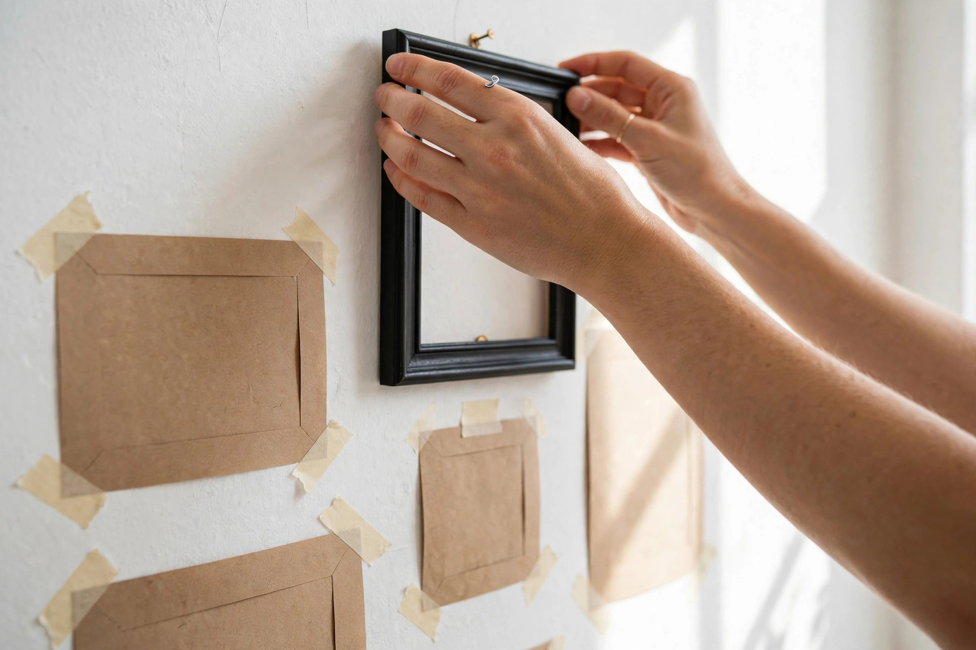
The paper template method is what professionals use, and it eliminates nearly all measuring mistakes. Trace each frame on kraft paper or newspaper, cut out the shapes, and tape them to the wall with painter’s tape. Live with the arrangement for a day — you’ll spot balance problems from the sofa that are invisible up close. When it looks right, hammer the nail straight through the paper, then tear the paper away.
Renters, you have excellent options now: heavy-duty adhesive strips hold frames up to 16 pounds on most painted walls, and French cleats distribute weight for larger pieces without a single screw. These damage-free gallery wall ideas living room renters swear by mean no lost deposits. Whatever you use, press a small level against each frame — in a grouping, one crooked frame undermines all the straight ones.
10. Small Living Room? Go Vertical
Tight on square footage? The best small-space gallery wall ideas living room designers use in city apartments all share one trick: they build upward instead of outward. A single vertical column of four or five small frames draws the eye up, makes ceilings feel taller, and needs only about 18 inches of wall width.
Scale is everything in a compact room. These gallery wall ideas living room owners love most keep frames at 8 by 10 inches or smaller, with one 11-by-14 anchor at most. Hold the palette tight — two frame finishes maximum — because small walls forgive less visual noise. And remember the oldest small-room trick in the book: include one mirror in the column and the whole living room feels twice as deep.
11. Mistakes to Avoid (and How to Fix Them)
Most gallery wall disappointments come from the same short list. Hanging everything too high is the classic — if the center of your arrangement is above 65 inches, lower the whole thing. Frames spread too far apart is the second; pull them into that 2-to-3-inch rhythm and watch the display snap together.
Other common misses: using only tiny frames on a big wall (add at least one anchor piece twice the size of the rest), mixing more than three frame finishes (spray-paint the outliers), and hanging art that has nothing to do with the room’s colors (pull one accent color from your rug or cushions into at least two pieces). Every one of these is fixable without starting over — and fixing them is what turns basic gallery wall ideas living room guests glance at into ones they ask about.
Final Thoughts
A great gallery wall isn’t about expensive art or perfect symmetry — it’s about a clear plan, consistent spacing, and pieces that mean something to you. I hope these gallery wall ideas for the living room give you the confidence to start: measure once, template with paper, and hang with conviction. That blank wall won’t know what hit it.


4 thoughts on “15 Stunning Gallery Wall Ideas for Your Living Room”