Blue wall art is one of the simplest ways to give a room colour, character and calm without repainting a single wall. A single canvas in deep navy can anchor a whole living room, a set of soft watercolour prints can make a bedroom feel restful, and a well-planned gallery wall can turn a plain hallway into the most interesting spot in the house. Because blue pairs so easily with neutrals, warm woods and metallics, it suits almost every decorating style, from coastal and Scandinavian to modern and traditional.
This guide covers everything you need to choose blue wall art with confidence: which shades work in which rooms, what size to buy, how to arrange a gallery wall, which frames flatter blue tones, and how to hang everything so it looks intentional rather than improvised. You will also find realistic prices, renter-friendly options and the mistakes worth avoiding, so the piece you buy is one you will still love in five years.
Why Blue Wall Art Works in Almost Every Room
Blue is the colour people reach for when they want a room to feel calm but not cold, interesting but not loud. Lighter blues open up small rooms and bounce daylight around, while deeper blues add drama and make pale furniture and warm wood stand out. That range is exactly why blue wall art is such a safe first purchase: even if you later change your sofa, rug or bedding, a blue piece usually still belongs.
There is also a practical advantage. Unlike a painted accent wall, art is movable. You can try a large canvas above the sofa, move it to the bedroom if it feels too bold, or split a set of prints between two rooms. For renters, that flexibility matters even more, since most landlords will allow a few picture hooks but not a full repaint.
Choosing the Right Shade of Blue
Not every blue behaves the same way on a wall. The shade you pick sets the mood of the room, so start with the feeling you want rather than the first print that catches your eye. Choosing blue wall art works best when you decide the mood first and shop second.
Pale Blue for Airy, Relaxed Rooms
Pale blue wall art, think sky, powder and washed denim tones, suits bedrooms, bathrooms and small living rooms. It reads almost like a neutral, so it works beautifully on white, cream or pale grey walls and in rooms with limited daylight. Pair pale blue prints with light wood frames and white mats for a soft, coastal feel that never overwhelms.
Mid Blue for Versatile, Everyday Spaces
Mid blues such as cornflower, steel and classic azure are the workhorses of blue wall art. They are strong enough to be noticed but soft enough to live with daily, which makes them ideal for family living rooms, dining rooms and home offices. A mid-blue abstract above a sideboard or a set of botanical prints in a hallway adds colour without dictating the rest of the room’s palette.
Navy and Indigo for Drama and Depth
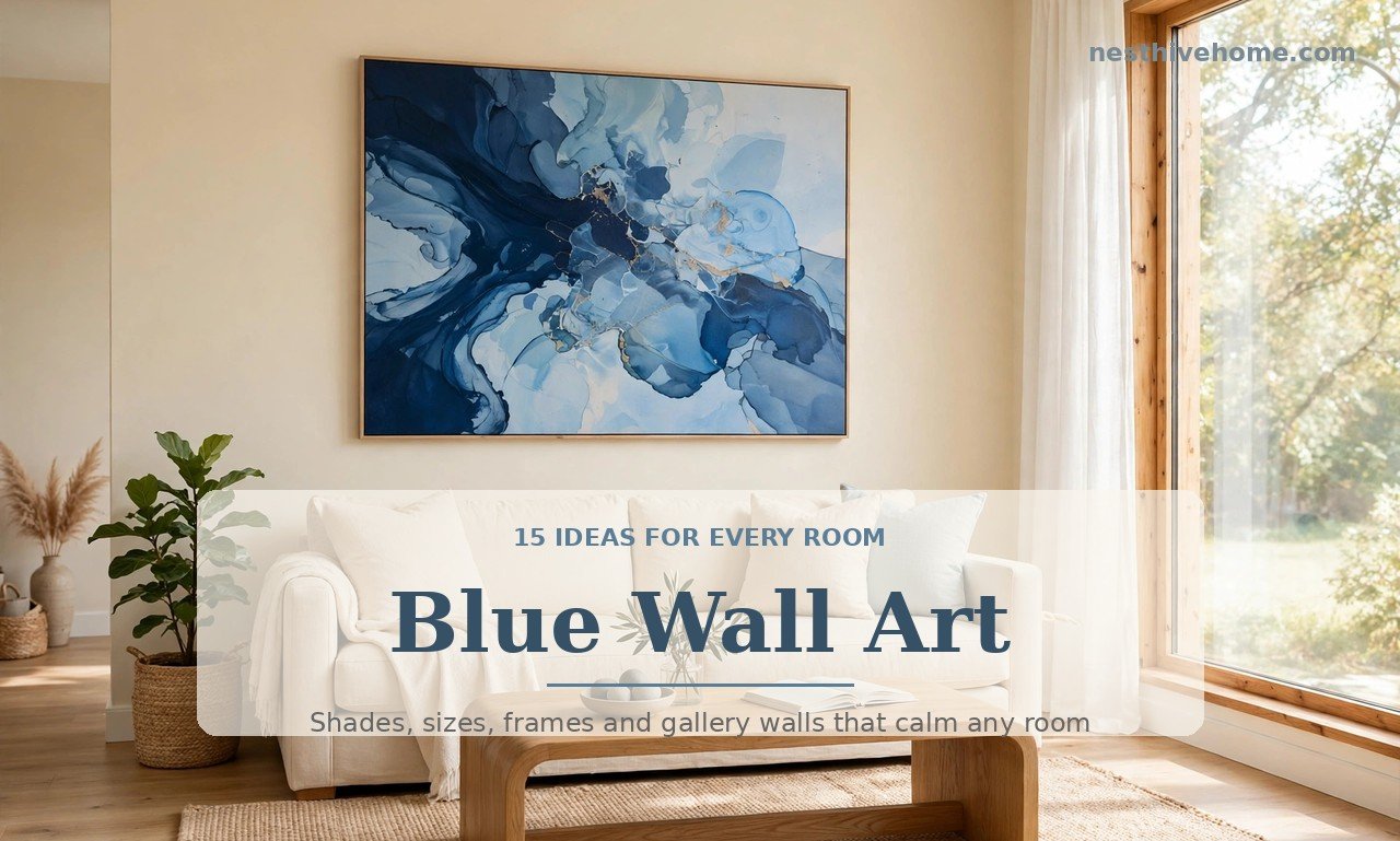
Deep navy and indigo pieces bring instant sophistication. A large navy canvas above a cream sofa creates a focal point that grounds the whole room, and indigo works brilliantly with brass, gold frames and warm leather. Save the darkest blues for rooms with decent natural light or good lamps, since navy art on a dark wall can disappear without enough contrast.
Teal and Turquoise for Warmth and Energy
Teal and turquoise sit between blue and green, so they pair naturally with warm woods, rattan and terracotta. If your room already has warm tones, a teal-toned piece of blue wall art will bridge the gap between the warm furniture and a cooler wall colour. These shades suit eclectic, bohemian and coastal interiors especially well.
Blue Wall Art Ideas for the Living Room
The living room is where most people hang their best piece, and it is also where scale matters most. A print that looks generous in a shop can look lost above a three-seater sofa, so measure before you buy: aim for art that spans roughly two-thirds of the width of the furniture beneath it.
One Large Statement Canvas
When in doubt, go big and go simple. A single oversized canvas, typically 90 by 120 centimetres or larger above a standard sofa, makes a stronger statement than several small frames scattered across the wall. Abstract washes, seascapes and geometric designs all work well at this scale, and a thin natural-wood or black frame keeps the focus on the art itself. Large-format blue wall art like this usually costs £80 to £300 in the UK or $100 to $400 in the US for a good-quality canvas print.
Build a Gallery Wall That Feels Collected
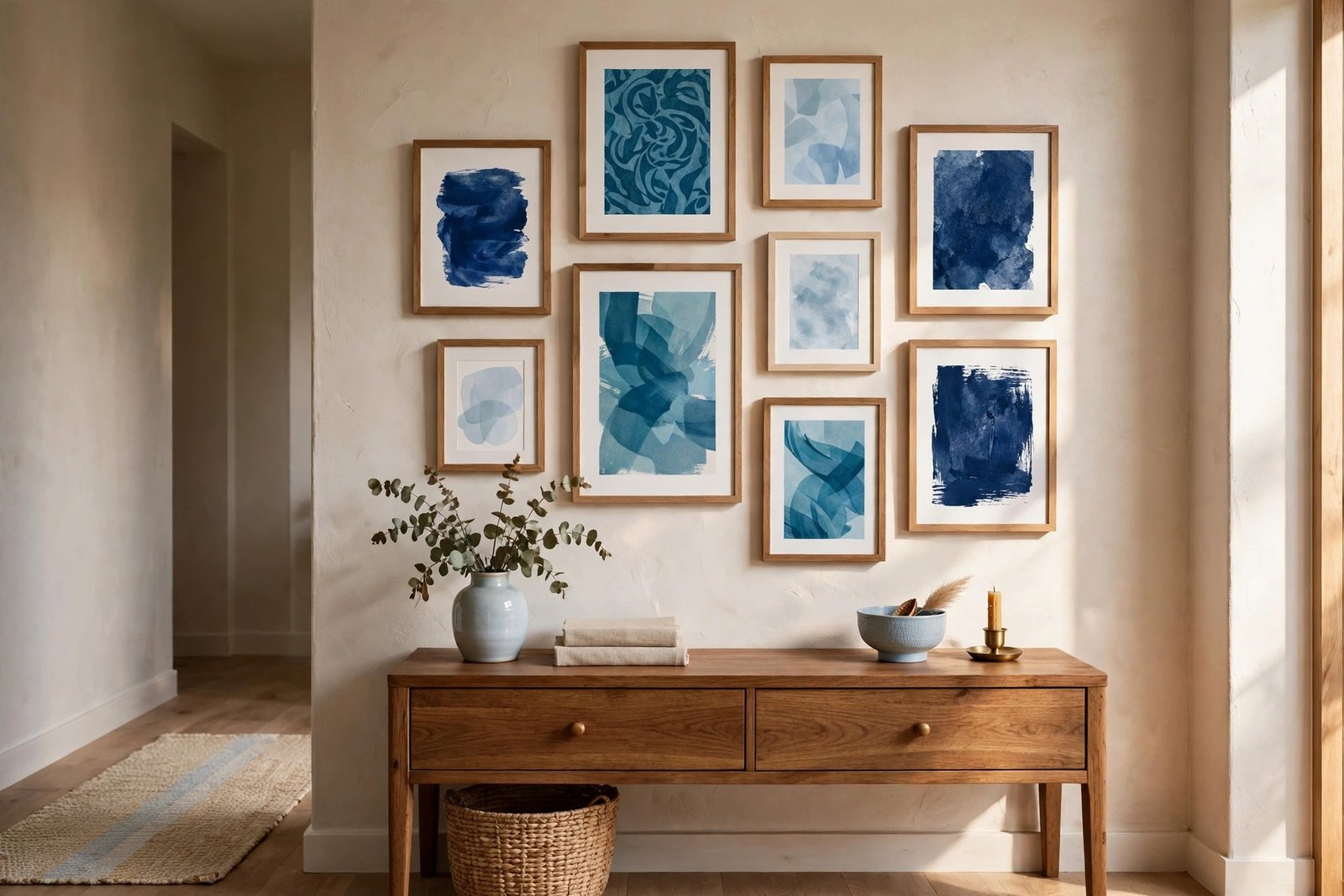
A gallery wall lets you mix sizes, styles and frames while keeping one colour thread running through the whole arrangement. Start with your largest piece slightly off-centre, then build outward, keeping 5 to 8 centimetres between frames. Use matching mats in white or cream to unify different prints, and repeat blue in at least half the pieces so the wall reads as a collection rather than a random assortment. If you are planning the layout, this gallery wall ideas guide for living rooms will help you plan spacing, symmetry and frame mixes before you pick up a hammer.
Coastal and Seascape Themes
Seascapes are the classic choice for blue wall art, and for good reason: waves, harbours and open skies bring a sense of space into a room. A single moody seascape suits a traditional living room, while a set of three bright coastal prints works in a lighter, beach-inspired scheme. Keep the frames simple, pale wood or white, so the blues stay the star.
Calm Blue Wall Art for Bedrooms
Bedrooms call for quieter art. Choose low-contrast pieces, soft abstracts, misty landscapes or delicate botanicals, in pale or mid blue rather than high-contrast navy. Hang the main piece centred above the headboard, with its centre roughly 140 to 150 centimetres from the floor, and keep the width within the width of the bed so the arrangement feels balanced.
A matching pair of prints, one above each bedside table, is a simple alternative that suits symmetrical bedrooms and costs less than one oversized canvas. In a bedroom, blue wall art pairs beautifully with white or natural linen bedding, a pale rug and one or two cushions that echo the art’s shade, which ties the whole room together without needing a full redecoration.

Small Spaces, Hallways and Home Offices
Small rooms benefit most from a single well-chosen piece rather than a busy wall. In a hallway, a vertical print draws the eye along the space and makes narrow walls feel taller. In a reading nook or home office, one medium print at eye level gives the room a finished feel without cluttering the wall you face all day.
For rented homes, look for lightweight framed prints or canvas pieces under 3 kilograms, which most adhesive picture-hanging strips can hold. Lean larger pieces on a console table or shelf instead of hanging them, which avoids holes entirely and lets you restyle the arrangement whenever you like. A small piece of blue wall art on a shelf, layered in front of a mirror or beside a plant, often looks more considered than a tiny frame lost on a big empty wall.
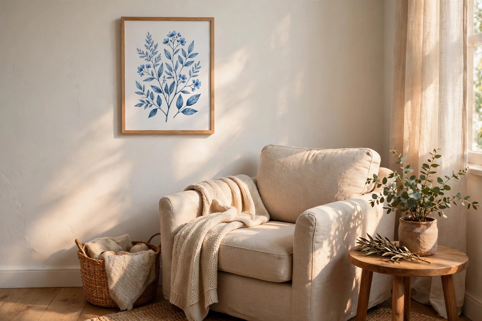
Frames, Mats and Finishes That Flatter Blue
The frame changes how blue reads. Natural oak and pale ash warm up cool blues and suit Scandinavian and coastal rooms. Black frames sharpen navy and indigo and suit modern interiors. Gold or brass frames add richness to deep blue and work beautifully in traditional rooms, while white frames keep pale blue prints feeling light and airy.
A wide mat in white, cream or soft grey gives the blue wall art breathing room and makes even an affordable print look more expensive. As a rule, the mat should be at least 5 centimetres wide on a medium print, and wider on large pieces. For canvas prints, a slim floating frame or no frame at all keeps the look contemporary. If you are choosing between finishes, hold the frame sample against the art in daylight: blue shifts noticeably between shop lighting and home lighting, and the frame should still harmonise in both.
How to Hang Blue Wall Art Like a Designer
Good hanging is mostly measurement. The centre of the artwork should sit at eye level, roughly 145 centimetres from the floor, or 15 to 20 centimetres above the furniture beneath it. Above a sofa or console, leave a gap of 15 to 20 centimetres between the top of the furniture and the bottom of the frame, which connects the art to the furniture instead of letting it float.
For gallery walls, lay the arrangement on the floor first and photograph it before hanging anything. Cut paper templates in the size of each frame, tape them to the wall, and live with the layout for a day before committing to nails. Use a spirit level for the largest piece and work outward from it, and check the arrangement from the doorway, which is how guests will first see it. If you want more inspiration for blue rooms in general, browse this Better Homes & Gardens guide to decorating with blue walls for shade pairings and room ideas.
Budget and Buying Tips
You do not need to spend a fortune. Good-quality open-edition canvas prints start around £30 to £60, framed art prints from independent sellers run £40 to £120, and original paintings start higher but are worth considering for a main living-room piece you will keep for years. Buy the largest size of blue wall art your wall and budget allow: undersized art is the most common regret, and a bigger print rarely looks wrong.
Check the print quality before hanging. Colours should look rich rather than washed out, and dark navy areas should show detail rather than flat black. If you are buying online, read reviews that mention colour accuracy, and choose sellers that show the print in a styled room photo rather than on a plain white background. For a cohesive home, buy pieces from the same collection or artist across rooms, which keeps the blues consistent even when the subjects differ.
Mistakes to Avoid with Blue Wall Art
The most common mistake is matching everything too closely. Blue wall art should echo the room’s palette, not duplicate it exactly: if your sofa, rug and curtains are all the same navy, the art will vanish. Instead, pick a piece that includes your room’s blue plus one contrasting accent, such as warm ochre, soft coral or natural linen, to give the eye somewhere to rest.
Other pitfalls are easy to avoid. Do not hang art too high, which is the single most frequent hanging error. Do not mix too many frame styles in one gallery wall; two finishes at most keeps the display calm. And do not buy art purely because it matches the sofa: choose pieces you genuinely like looking at, since wall art stays in view far longer than any cushion or throw.
Bringing It All Together
Start with one room and one piece of blue wall art you love, in a shade of blue that suits the light and the furniture you already own. Hang it at the right height, give it room to breathe, and let it guide small supporting choices such as a cushion, a vase or a throw in a related tone. Once that first piece feels right, extending the look to a gallery wall or another room becomes easy, because you already know which blues work in your home.
Blue wall art earns its popularity honestly: it calms a busy room, adds colour without commitment, and adapts to almost any style. Choose the shade with care, get the size right, hang it properly, and a single piece can quietly transform how your whole home feels.